More than six years after Microsoft launched Windows 10, Windows 11 is finally here. It’s been one of the longest waits between operating system versions in Microsoft history. Has it been worth the wait?
More important, when (and if) you’re offered the upgrade through Windows Update, should you take the leap?
I’ve put the operating system through its paces (with an eye to business use). Among the most significant changes I found are a smartly redesigned Start menu, tweaks to Search and Widgets, better integration with Teams (albeit for personal use, not business), enhanced security with TPM 2.0, and thoughtful fit and finish improvements throughout.
I’ll cover all that and more in this review, including when you might be able to upgrade — and if you can at all. I’ve also included a section near the end of the story detailing what IT needs to know about the new OS.
Read on for details about which new features are worth cheering about — and which miss the mark.
Slow rollout and strict hardware restrictions
First, some background about hardware requirements and rollout dates. In order to run Windows 11, you’ll need a PC that has a 1GHz or faster processor with two or more cores on a supported 64-bit processor or system on a chip (SoC). (Go here for a list of compatible processors). You’ll have to have 4GB or more of RAM and at least 64GB free on a hard disk or SSD. And you’ll also need Trusted Platform Module (TPM) version 2.0, which offers hardware-based security.
Most PCs sold in the last three or so years will likely be able to run Windows 11. But not all. I bought a laptop a year ago, and it can’t run the new OS, because it doesn’t have a compatible processor. You can check whether your machine makes the cut by downloading and running Microsoft’s PC Health Check app. (For details and other options, see “How to check if your PC can run Windows 11.”)
Even if your PC can run Windows 11, that doesn’t mean you can upgrade to it yet. Microsoft is taking a slow, phased approach to rollout. A Microsoft blog post says, “new eligible devices will be offered the upgrade first” but doesn’t detail what “new” means. It adds, “We expect all eligible devices to be offered the free upgrade to Windows 11 by mid-2022.” When you can upgrade, you’ll be notified via Windows Update.
Business users, of course, will be upgraded to Windows 11 only when their IT departments allow it. Microsoft is offering several tools to help administrators assess their Windows 11 readiness; see “What IT needs to know about Windows 11” for details.
Okay, that covers the basics. Let’s get down to details.
A new start for Start
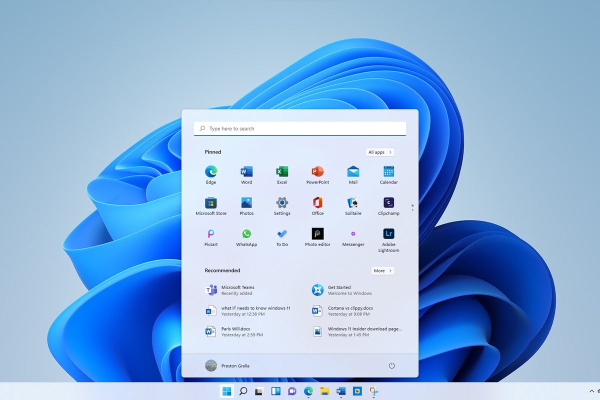
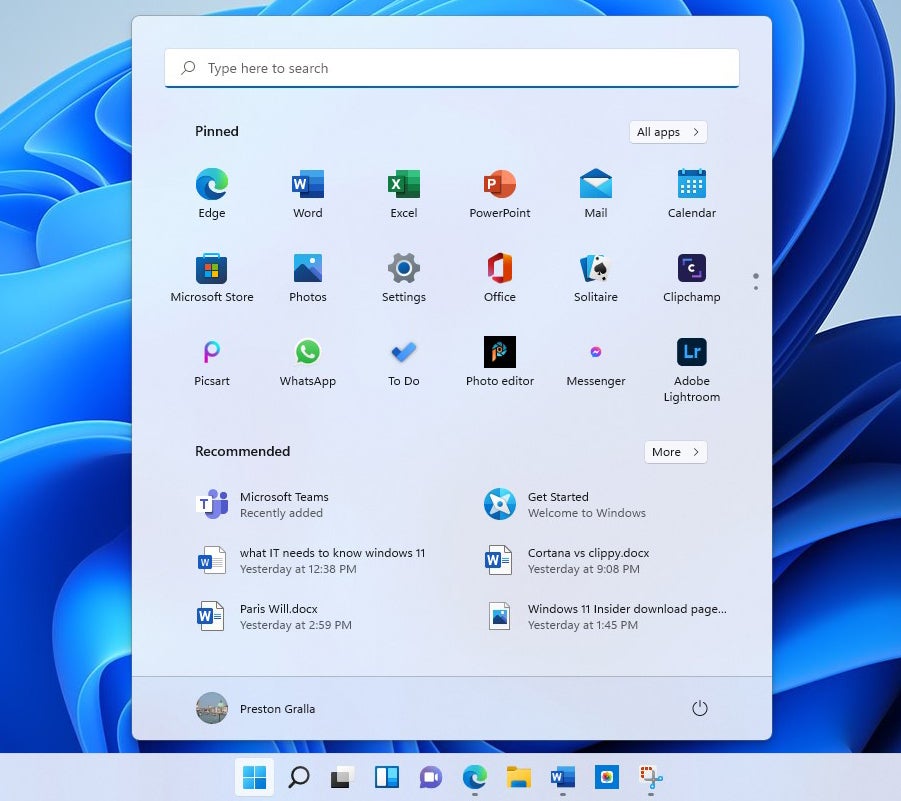
The most visible change in Windows 11 is front and center — literally. When you click the Start button, the Start menu launches to hover just above the bottom center of the screen, rather than being anchored to the left as it is in earlier versions of Windows.
It’s also been reduced in size, and you don’t scroll through it as you do through the Windows 10 Start menu. The large tiles that take up so much screen real estate on the Windows 10 Start menu have been replaced with smaller application icons. That means that live tiles, which could pipe in and display changing information, have been given the boot. In their place, as you’ll see later in this review, are widgets.
 IDG
IDGThe sleeker, simpler new Start menu is a great improvement over Windows 10’s. (Click image to enlarge it.)
The menu has been stripped down in other ways as well. The Windows 10 Start three-column design is gone, replaced by a simple screen divided into two sections: pinned applications icons at the top and a “Recommended” section at the bottom composed of a mix of recent files you’ve opened and icons for apps you’ve recently installed.
This less-is-more approach works admirably. The compact design lets you quickly find the apps you want to run, because more of them are visible in a less-cluttered interface. You get more choices and also a clearer view of what’s available. If you don’t immediately see the app you want to run, click the All apps button at the upper right to get to a scrollable alphabetical list of every app on your PC, or use the search bar at the top of the menu (more on that in a moment).
You can easily unpin an app from the Start menu — right-click it and select Unpin from Start. To pin an app to the menu, click All apps, scroll to one you want to pin, right-click it and select Pin to Start.
The Recommended section is also useful. The files you’ve most recently opened are right there in front of you, so it’s much easier to get back to work you’ve recently done. To look for more of them, click the More button, and you get a long, easy-to-scroll list. You can unpin a file from Recommended by right-clicking it and selecting Unpin from Start. However, you can’t pin a new file to it.
Search is integrated directly into Start via a text box across the top of the screen. But you may find yourself disconcerted when you click it, because doing that doesn’t place a cursor in the text box and let you start searching. Instead, a search screen pops up, the same one you’ll see when you click the Search icon on the taskbar. It takes some getting used to.
You can also manage your user account from Start by clicking your account icon at the bottom left of the screen. And you have access to actions such as putting your PC to sleep, shutting it down, and restarting it by clicking the power button at the bottom right.
Only after I worked with Windows 11 for a while did I realize just how cluttered the Windows 10 Start menu was, and a result, how little I used it. The new Start menu is not just more aesthetically pleasing, but I found myself using it more than the old Windows 10 Start menu. Most useful for me is the Recommended section. To open a file I’ve recently used, I don’t have to hunt through File Explorer or launch an application, then browse for the file. Instead, I just click a file right in front of me. It’s a considerable time-saver and productivity booster.
In short, the new Start menu is a winner and the thing I like most about Windows 11.
A slightly tweaked Search
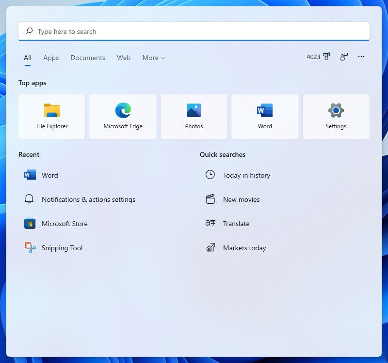
Search has gotten a once-over-lightly redesign, but not much has really changed. When you click its icon, Search, like Start, pops up in the center of screen just above the taskbar. The softer, rounded feel of Windows 11 is used to good effect here, and Search is more pleasing to the eye. It’s more compact than Windows 10 Search as well. Because it uses smaller icons than does Windows 10 search, it’s able to fit more into less space, offering four “quick search” icons compared to Windows 10’s three.
 IDG
IDGWindows 11’s slightly tweaked Search pane is easier on the eyes than Windows 10’s. (Click image to enlarge it.)
The basic layout stays the same, however, and I found no difference in Search results in Windows 11 search compared to Windows 10.
One change is fairly useless: When you hover your mouse over the Search icon on the taskbar, it displays the last three searches you did that resulted in you clicking on something in Windows 11, such as an app or a setting screen. Those three searches are the same as the first three that are displayed on the lower-left of the Search screen itself. (Note that Windows 10 also displays that type of search results on the lower left of its screen.) If Microsoft wanted to make this hover feature useful, it would display your most recent three searches, not just those that result in you clicking on a Windows app or setting.
I found one other change slightly distracting: When you click on any of the categories in the horizontal row towards the top of the screen (Documents, Web, etc.) to narrow your search, Windows 11 automatically appends matching text to the beginning of your search, for example, “apps:” when you click Apps. Windows 10 Search doesn’t append text in that way when you narrow your search. It’s not at all clear why Microsoft made this unnecessary change.
Snap Layouts and Snap Groups
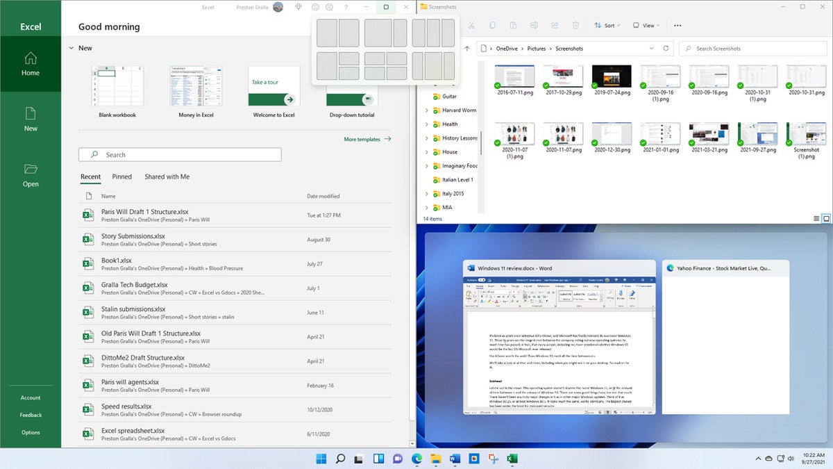
Microsoft introduced a pair of features it hoped would offer a productivity boost — Snap Layouts and Snap Groups — but I found them to be a mixed bag at best. With Snap Layouts, you can group your open windows into one of a half-dozen pre-built screen layouts, such as having two apps side by side, each taking up half the screen. Or you might have one app on the left and two stacked vertically on the right, or four apps in a grid. The idea is that you’ll be able to find the perfect layout for you, one that fits the way you work.
To use Snap Layouts, first open the applications you want to be in it, then hover your mouse over an application’s maximize icon on the upper right of the screen, located between the minimize and close icons. Choose the layout you want and which position you want the application to be in, and the app window snaps into that position. Then you can choose from your other open apps to fill in the rest of the spots in the layout.
 IDG
IDGSnap Layouts proved to be one of the more disappointing features of Windows 11. (Click image to enlarge it.)
Once all the places in a Snap Layout are filled, that app grouping is saved as a Snap Group that you can quickly return to later if you’ve opened other apps or minimized any of the app windows in the group. Hover your mouse over the taskbar icon of any of the applications in a Snap Group, and you’ll see two small popups — one that’s a thumbnail of what’s open in the application itself, and another that shows the Snap Group. Choose the Snap Group icon and you switch to the whole group in the layout you set up previously, rather than to the individual application.
All this sounds fine in theory, but in practice I found it more annoying than useful, and confusing to use. It took me a while to figure out how to choose which application should go into what part of an individual Snap Layout, and I only discovered how to use the Snap Group feature after a good deal of clicking around.
More important, I found that arranging applications in a Snap Layout was of no use to me whatsoever. As they say, your mileage may vary, but for me these features were a big letdown.
The Widgets sideshow
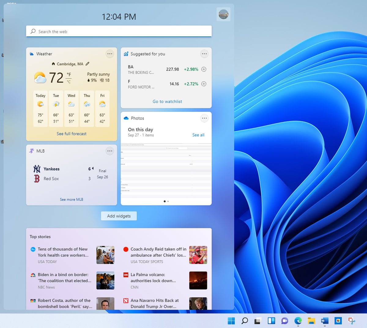
Windows 10 included a number of widgets such as a news feed, weather, and more. Although you could run them individually, they never really had a home of their own. In Windows 11, that’s changed. Click the Widgets icon on the taskbar (it’s a square divided vertically into two sections, one white and one blue), and a large panel appears on the left side of the screen showing a preselected set of them, including weather, news, sports, and others.
Each displays changing information; click one and you’re typically sent out to the web to get even more details. You can change the size of each widget, remove it, and customize it by clicking the three-dot menu icon at its upper right.
 IDG
IDGWidgets have been made more accessible in Windows 11. (Click image to enlarge it.)
Click the Add widgets button, and you’ll see a selection of even more you can choose from, such as one for checking traffic, a to-do list, Windows tips, entertainment, and several others.
I found widgets to be moderately useful for when I wanted a quick news hit or to find out about the weather. I would have liked a wider selection of them. I also would have liked to be able to resize the widget pane to make it smaller, and to keep it onscreen all the time, so I didn’t have to constantly click the taskbar Widgets icon to see them.


