
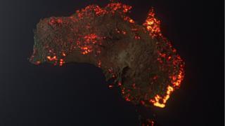
 Image copyright Anthony Hearsey
 Maps and pictures of Australia’s unprecedented bushfires have spread widely on social media.
Users are posting them to raise awareness of the devastating fires, but some of the viral maps are misleading, spreading disinformation about the crisis.
The months-long fires have killed at least 25 people and millions of animals, and destroyed more than 2,000 houses.
After milder weather brought brief respite last weekend, fire crews are preparing again for worsening conditions as temperatures are predicted to soar on Friday.
Artist’s visualisation misinterpreted
One image shared widely by Twitter users, including by singer Rihanna, was interpreted as a map showing the live extent of fire spread, with large sections of the Australian coastline molten-red and fiery.
But it is actually artist Anthony Hearsey’s visualisation of one month of data of locations where fire was detected, collected by Nasa’s Fire Information for Resource Management System.
“The scale is a little exaggerated due to the render’s glow, but it is generally true to the info from the Nasa website. Also note that not all the areas are still burning, and this is a compilation,” Mr Hearsey wrote on Instagram in response to criticism by viewers that the image was misleading.
Misleading symbols
Another widely shared map of flame icons dotted across the country claims to show “all the fires burning in Australia”.
It is taken from the Australian government website MyFireWatch, which uses satellite data to map heat sources.
However the data incorporates “any heat source that is hotter than its surroundings… This may include gas flares, refinery furnaces or highly reflective large industrial roofs”, according to its website.
That means that the symbols are not guaranteed to indicate actual fires.
Another issue is that the hotspot symbols do not represent the actual size of fires or the danger posed by them.
Screenshots of maps shared on social media like this often omit important details from the originals, such as the level of risk posed by fire and whether it is under control.
The New South Wales Rural Fire Service publishes live mapped fire information, using symbols to indicate the alert level from “advice” (no immediate danger) to “emergency warning”.
On 7 January, the red and orange fire symbols in the MyFireWatch map of New South Wales (NSW) are all ranked as “advice” alerts by the NSW rural fire service.
Media playback is unsupported on your device
As some Twitter users pointed out, maps that claim to show the size of the affected area by “overlaying” Australia on to other continents like North America and Europe are not completely accurate.
This is due to how how the curved earth is distorted when flat map projections are made.
How BBC News made maps of Australia fires
BBC News produced a visual guide to the fires, which uses a range of data sources to produce maps and other visualisations.
To produce the map of fires, BBC journalists used Python code to extract geographic data from the live fire maps produced by the NSW and Victoria fire services.
“This allows us to plot the complicated fire area shapes quickly on to more basic maps. We’ve been updating it every one-to-two days while the fires have been at their height and will continue to do so as long as the crisis lasts,” data journalist Tom Housden explained.
The BBC’s visualisations also used Nasa’s fire data to map how the fires spread.
Nasa told the BBC that although its data is collected by satellites that detect heat, including non-fire hotspots like gas flares, these sources account for “less than 1% of the data”.
Click Here to Visit Orignal Source of Article https://www.bbc.co.uk/news/blogs-trending-51020564