


Back in Android’s earliest days — way, way back in the prehistoric era of 2010 and the years around it — the platform was a promising but messy piecemeal effort. It was fresh, it was packed with power and potential, and it was absolutely exciting. But it also had virtually no standards surrounding it, and it consequently felt like a mishmosh of conflicting interface styles and design patterns.
In those early days, in fact, that was a frequent criticism you’d hear from folks on the Apple side of the fence: Android was inconsistent. It was disjointed. It wasn’t, ahem, an elegant user experience.
And you know what? In many ways, they were right. Android had a lot to offer from the get-go and presented some intriguing advantages over Apple’s then especially locked-down and tightly controlled approach, but design and interface consistency were certainly not strengths of the platform at that point. Anyone who tries to tell you otherwise is either delusional or forgetting what, exactly, the experience of using a Gingerbread-era Android device was like. Powerful? Yup — you’d better believe it. But polished? Yeah — not so much.
That all started to change in 2012, when Google began to emphasize its first formal set of interface and design guidelines for Android — a style known as Holo. “Using system themes means developers can take advantage of a user’s existing expectations,” as Google put it at the time. Having platform-wide guidelines, the company went on to explain, would allow developers to “design an app with a single predictable look and feel.”
And boy, did that make a world of difference. The presence of design guidelines helped bring a consistent look and feel not only to Android itself but also to the apps around it — which in turn brought a much-needed sense of cohesiveness to the broader platform and made it immeasurably easier, as a user, to know what to expect. Even when you aren’t actively thinking about it, knowing that certain functions will always be in certain places and act a certain way allows you to move around your phone naturally and easily, without any ongoing thought or effort. And coming from the Wild West that Android and its apps had been up to that point, having that added sense of unity completely changed what the platform was like to use.
And Google wasn’t done yet. The unification extended even further with the launch of the Material Design standard two years later. So much progress! And yet somehow, almost seven years down the road, it feels like we’re moving back in the opposite direction.
Android today still has a design standard — an evolved version of that same Material Design concept — but the consistency that standard was originally created to achieve seems to be slipping away more with every passing month. And the experience of using an Android device, I’m sorry to say, is slipping right alongside it.
Android and the decline of the design standard
The entire point of having a design standard, as the term suggests, is to establish, y’know, a standard — and the all-important qualities of consistency, cohesiveness, and unity that come with it. And yet, using Android today, you rarely know what to expect when moving from one app or process to the next.
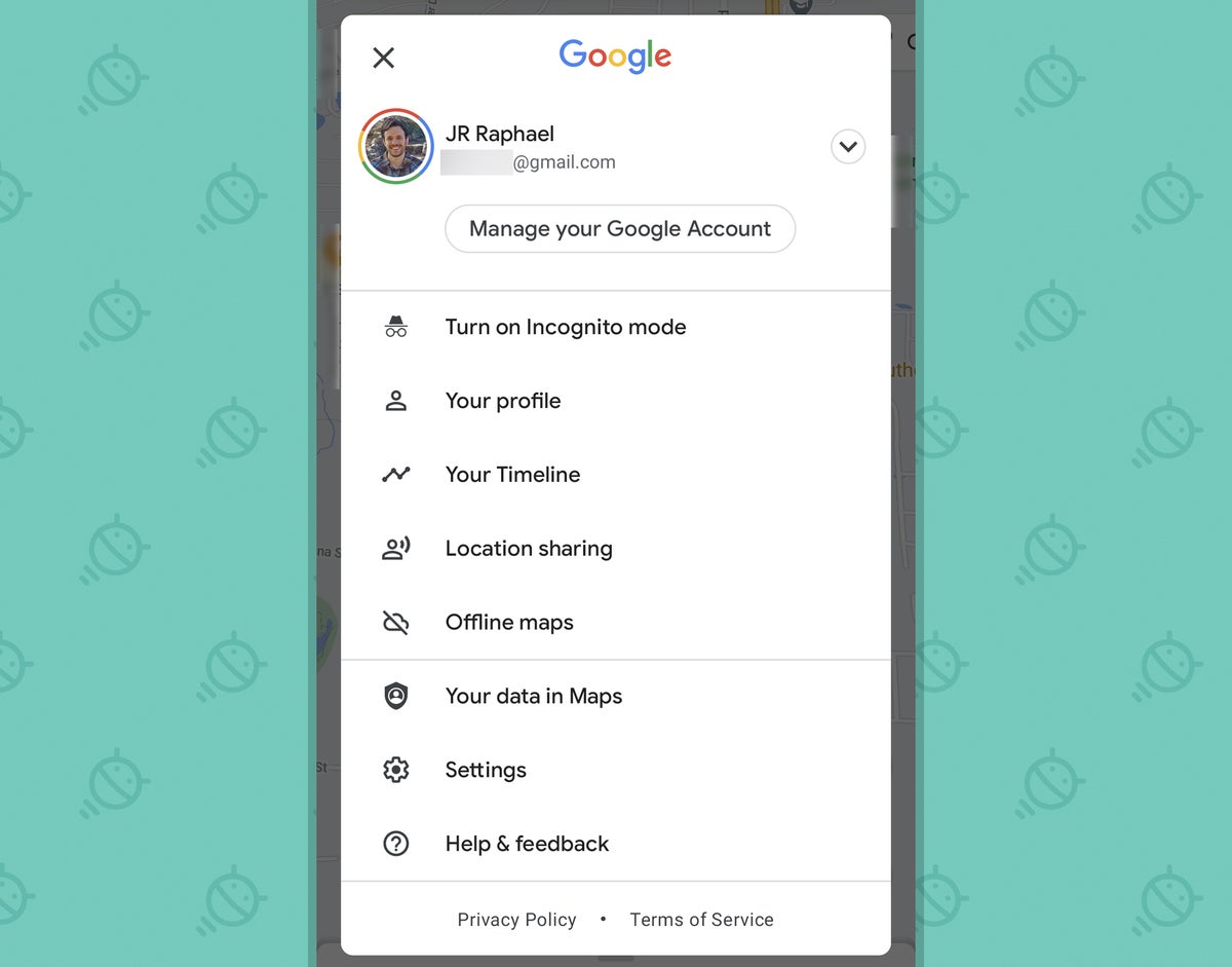
Take the system-level sharing menu, for instance — a key part of the Android experience and one of the operating system’s longest-standing strengths. The sharing menu, if you aren’t familiar, is that series of options that comes up when you tap the command to share something from one app to another — like sharing an article from your browser into an email or sharing an image from Photos into a cloud storage service.
When you tap a basic, system-level command like that, you should know exactly what to expect. The subsequent actions should be little more than muscle memory. And yet, despite the fact that Android has a system-level standard — one that’s been improved immensely over the last several Android versions — the menu that pops up upon pressing a share command in an app is completely unpredictable.
The reason why is actually quite simple: Instead of sticking with the standard system interface, lots of apps now opt to create their own sharing menus — menus that provide the same exact function as the system standard, in many cases, but with a completely different and often arbitrarily reorganized interface. This is true of numerous high-profile third-party apps, such as Pocket and Firefox. And, perhaps most surprising of all, it’s true of an ever-expanding number of Google-made apps — including Chrome, Google News, Google Maps, Photos, YouTube, and YouTube Music.
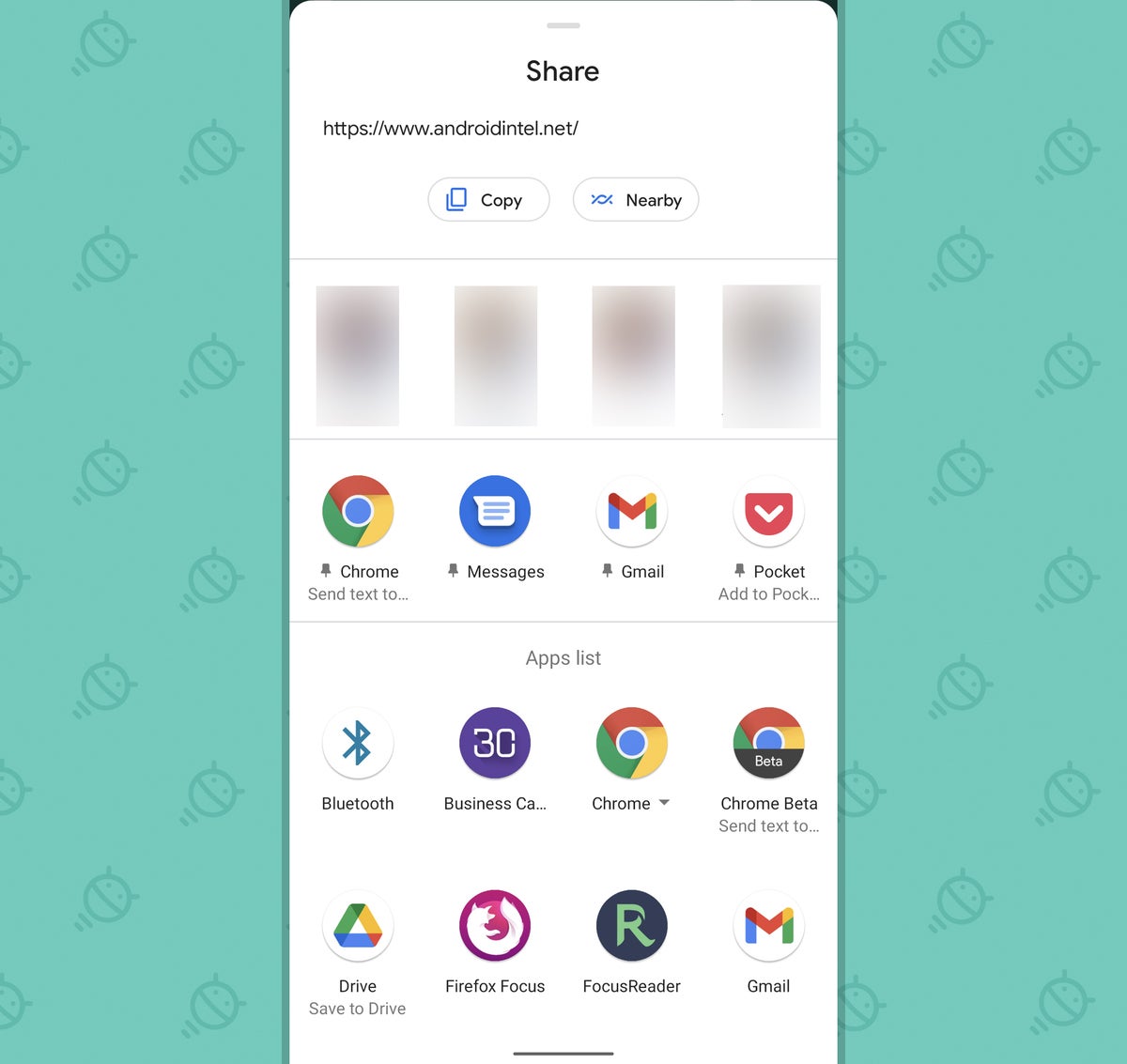
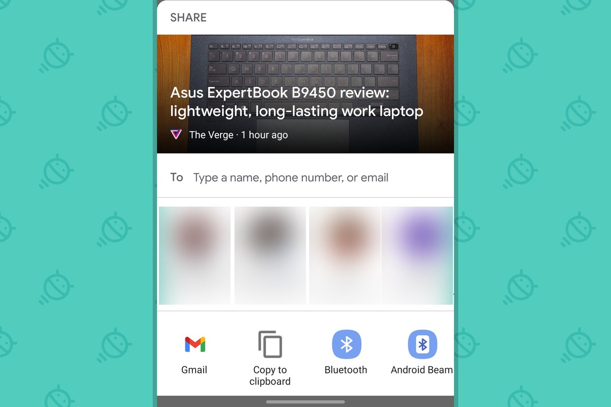
Here, for illustration, is the actual system sharing menu in Android:
 JR
JR It features specific suggested sharing targets on its top row and gives you the ability to create a row of your own favorite apps for sharing beneath that, after which you see a scrolling list of every other available share target on your device. Handy, right? Absolutely! But then you go to share something from, say, Firefox — and instead of getting that standard menu, you get this:
 JR
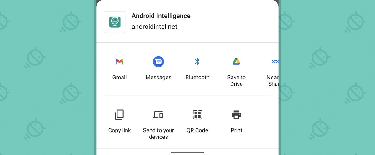
JR In Pocket, it’s this:
 JR
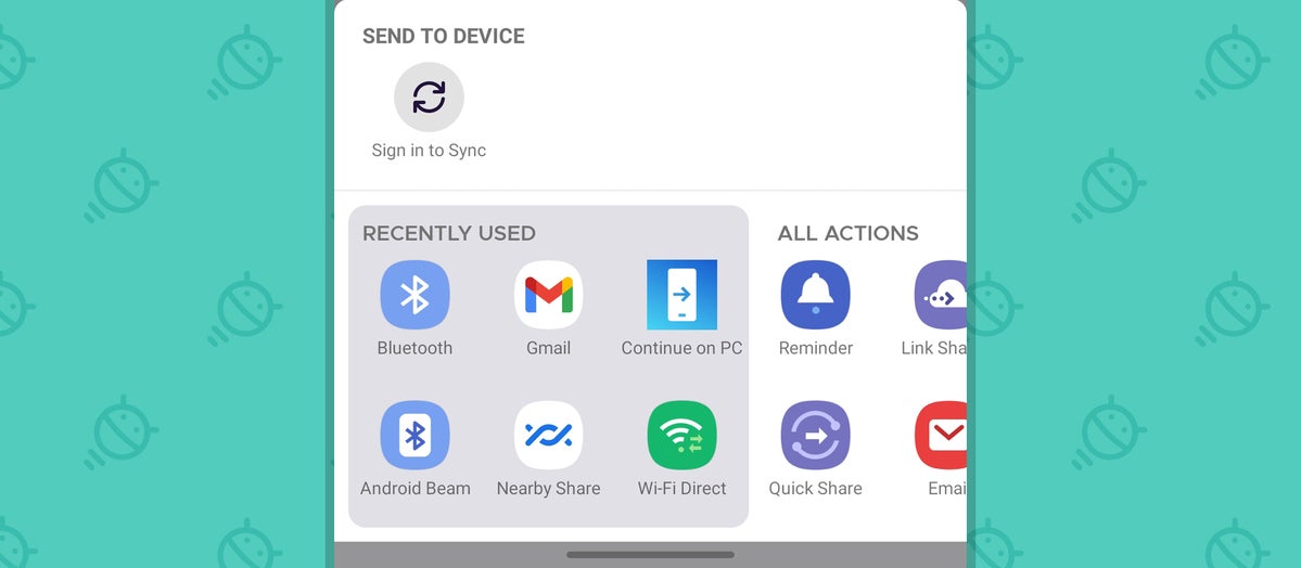
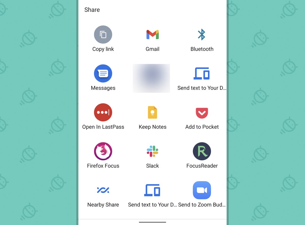
JR And in Google’s own Chrome browser — the default stock browser app for Android — you get this:
 JR
JR Even more vexing, if you want to get to the standard system share menu from that clumsy Chrome alternative, you can — and you’ll frequently need to, since that custom menu includes only a small portion of the available targets on your phone — but in order to do so, you have to scroll horizontally, all the way to the right of the menu’s middle line, and then tap a “More” option at its far end. I’m not sure you could make that process much less intuitive or convenient if you tried.
Worse yet, that horizontally-scrolling mess is almost becoming a bit of an alternate standard for some of Google’s apps. It’s vaguely similar to what you see when sharing something from Google News:
 JR
JR And also from Photos:
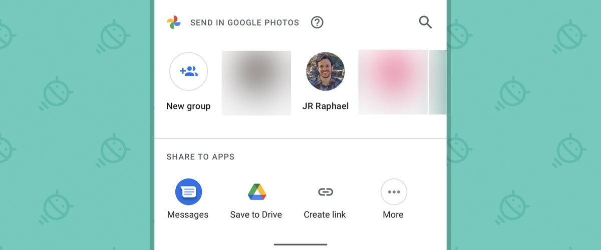 JR
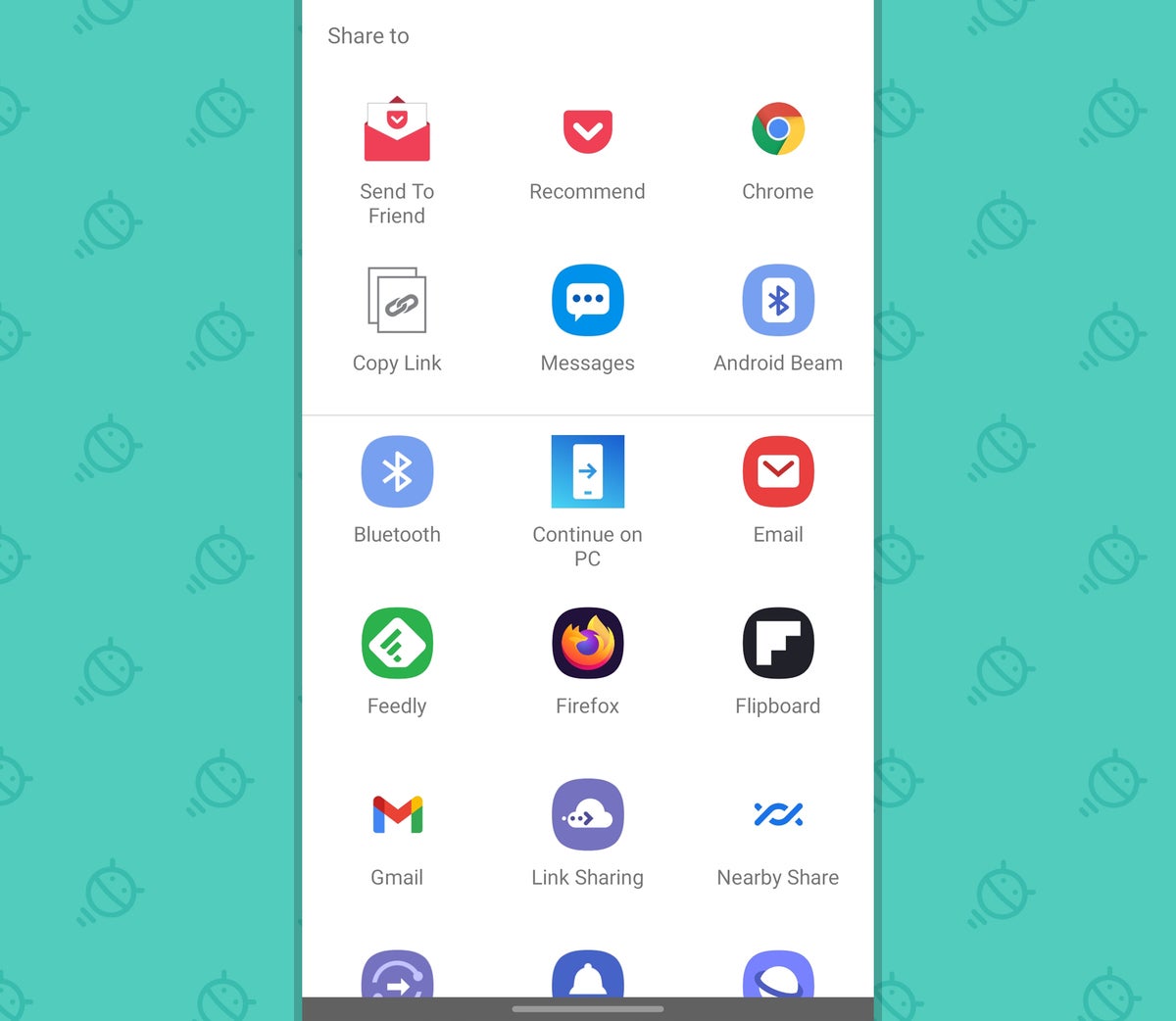
JR YouTube and YouTube Music have their own totally different alternate standard with their custom share interfaces. Egads?!
 JR
JR Now, some of these interfaces have apparent purposes and reasons for existing — like the one in Photos, which includes app-specific options for sharing images within that service in addition to the usual external destinations. Others, like the ones in YouTube and YouTube Music, seem to serve no discernible purpose other than just being different for the sake of being different. But all of them, regardless of their reason for existing, ultimately accomplish the same thing: creating confusion and inconsistency and making Android meaningfully less polished, cohesive, and pleasant to use.
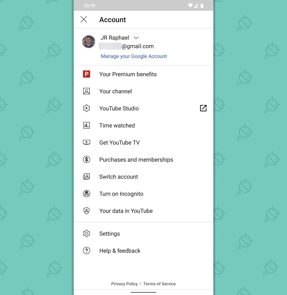
This backwards progress doesn’t stop with share menus, either. Move from one Android app to the next — even within Google’s own homemade applications — and you’ll see a dizzying array of styles for basic system elements like the main app menu and the series of settings within it. Sometimes, you tap a three-line menu icon in an app’s upper-left corner to find its settings. Other times, you tap a three-dot menu in an app’s upper-right corner to find the same thing. And other times, you tap your profile photo in the upper-right corner to uncover a hidden menu with settings and other important options.
The trouble goes deeper from there: Even within that profile photo menu setup, the style, design, and purpose of the interface varies wildly from one Google app to the next. In Gmail, Docs, and Drive, for instance, it takes on a simple-looking form and holds only commands for switching accounts, since the apps’ other settings are accessed via a three-line menu icon.
 JR
JR In Maps, the interface is similar but the contents are totally different — with options for switching accounts along with a link to the app’s settings and lots of other top-level commands.
 JR
JR YouTube, meanwhile, has a similar sort of setup but with a different design — one that’s less of an overlay card and more of a full-screen, separate-area menu.
 JR
JR And speaking of menus, after years of clear and deliberate guidelines discouraging the use of bottom-bar menus within apps, Google has started using those elements liberally in its own apps and actively encouraging their use elsewhere as well. The notion of a change in standard is one thing, but the actual result here is a new lack of any standard and a mishmosh in what sorts of patterns you encounter, within Google’s own apps and beyonds.
Again, it leads to inconsistency and unpredictability — the enemies of effective and efficiency-aiding interface design.
Some broader perspective
Now, let’s step back for a minute and ask ourselves: Is all of this making a mountain of a molehill? I can see how some might say that. After all, it’s undeniable that by and large, normal, non-tech-nerd users don’t consciously think about or notice things like user interface design — nor should they.
But as any professional designer will tell you, it’s also undeniable that folks do notice, even if implicitly, when certain apps or experiences are more effective than others. And that, dear friends, is exactly how it oughta be. Good design shouldn’t be something you actively think about; it should be something that just makes interfaces easy and enjoyable to use. As one oft-quoted maxim puts it: “Good user interface design facilitates finishing the task at hand without drawing unnecessary attention to itself.”
What we’re seeing now in Android — from the lack of consistency and standard-adherence with the share menu to the disjointed, varying approaches to menu placement and basic command positioning — is exactly the opposite of that. Even if you don’t explicitly think, “Hey, this function isn’t where I expected it to be!” or “Hmm, I’ve really had to dig around to find that setting I need,” you do notice that things aren’t as intuitive as they could be. You do notice that you’re working harder to do the stuff that should be easy to accomplish. And you do notice, on some level, that the experience of using the phone isn’t quite as smooth and simple as you might expect.
Google’s dug itself into an unfortunate hole with this, but it isn’t too late. All it’d take to change course is a commitment to consistency within its own ranks and then a matching communication to the rest of the ecosystem — the same way the company did back in 2012, when the Holo standard emerged, and again in 2014, when Material Design arrived and pushed Android toward a newfound level of polish and cohesiveness.
As Google design guru and Material Design mastermind Matias Duarte said at that time: “There’s nothing worse than the physics of a world being inconsistent, because it means you’re constantly learning — constantly a child and constantly learning because everything is new and a surprise and it’s inconsistent, and you can never settle down into being efficient and optimizing.”
Material Design, he went on to say, was “all in the service of creating a system that’s optimized for helping your brain do as little work as possible.”
That simple, foundational strategy is precisely what’s been lost over the years. But with a little dedication and a lot of recommitment, good golly, Google can get it back. The only question is if it actually wants to make that happen.
Sign up for my weekly newsletter to get more practical tips, personal recommendations, and plain-English perspective on the news that matters.
